Portfolio Details
Project information
- Name: Medimatch - Connect
- Project date: January 2025
- Role: UX designer
- Time: 3 Months
Details:
Medimatch - Connect is a healthcare-informed booking assistant platform for all health and wellness needs
My role: This is an individual project that allowed me to plan and direct each step of the design thinking process as a UX designer with mobile and web UI design experience.
Responsibilities:
-
Conduct user research
-
Define the problem and provided insights to inform the ideation phase
-
Define personas and user journeys
-
Visual design of low-fi and high-fi wireframes, prototypes, and user testing
The problem and goal
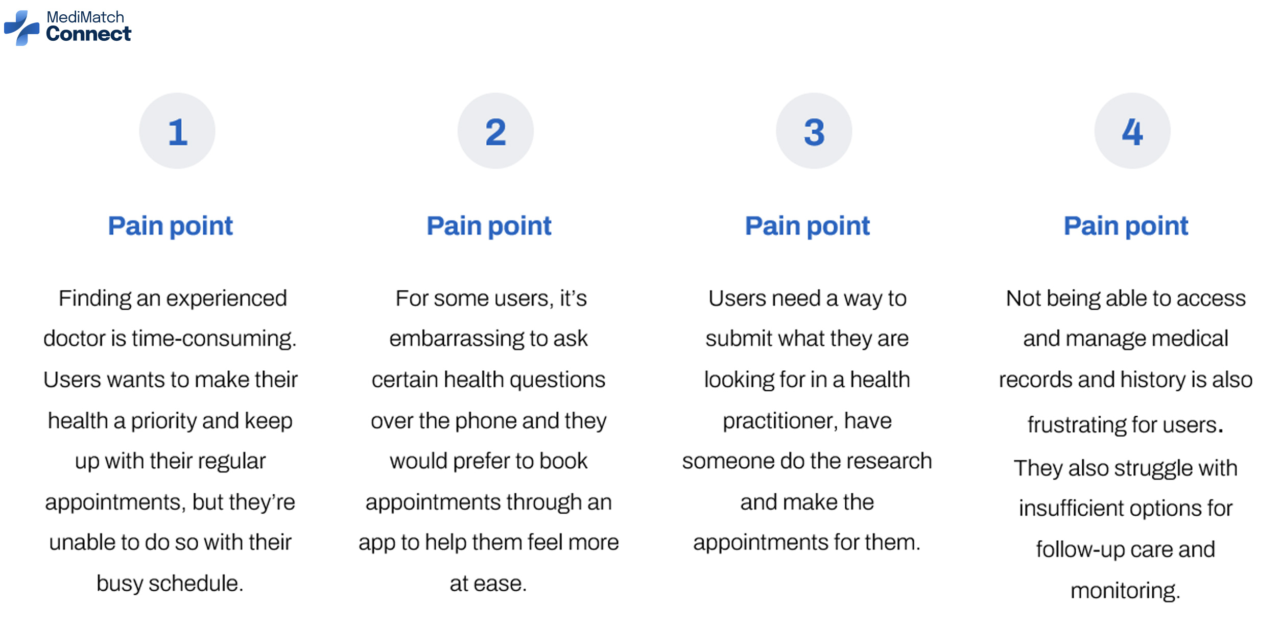
Problem: Users need a way to use a health assistant to provide tailored research for their specific health needs. This is because they are busy and often struggle using their health insurance’s web portal to find a health practitioner and schedule an appointment.
The Goal:To give people a simple, customized, and intuitive way to book with health practitioners in nearly any field quickly by using an informed health assistant
User research
To understand user frustration, needs, and requirements, I conducted user research through interviews and user surveys for my project. My goal was to gain insights into the needs and wants of users so that I can better design my app and responsive website.There are two types of user research methodologies: qualitative and quantitative research. I chose qualitative research because I had a time constraint.
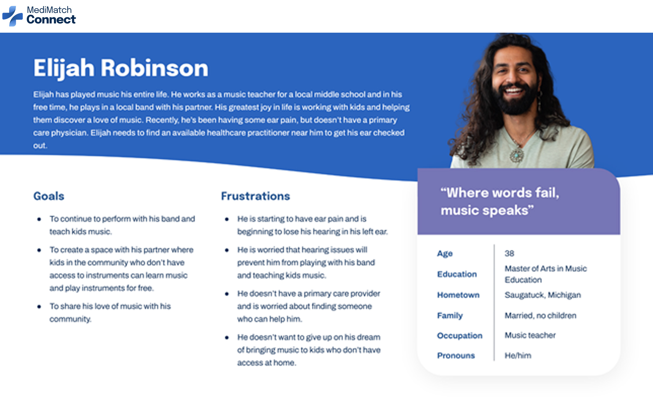
User persona
Problem statement: Elijah is a musician and music teacher who needs to book a doctor’s appointment because he has a health concern about his ears.
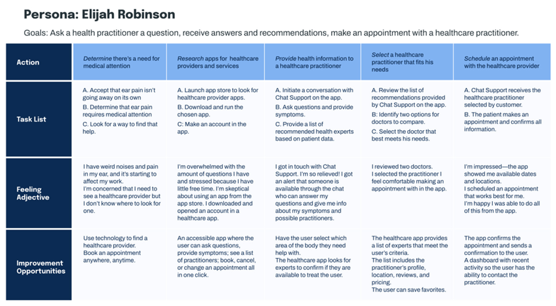
User journey map
By creating user journey maps, I wanted to illustrate the process of how Elijah behaves, feels, and what he thinks while accomplishing his goals to address pain points or provide moments of delight.
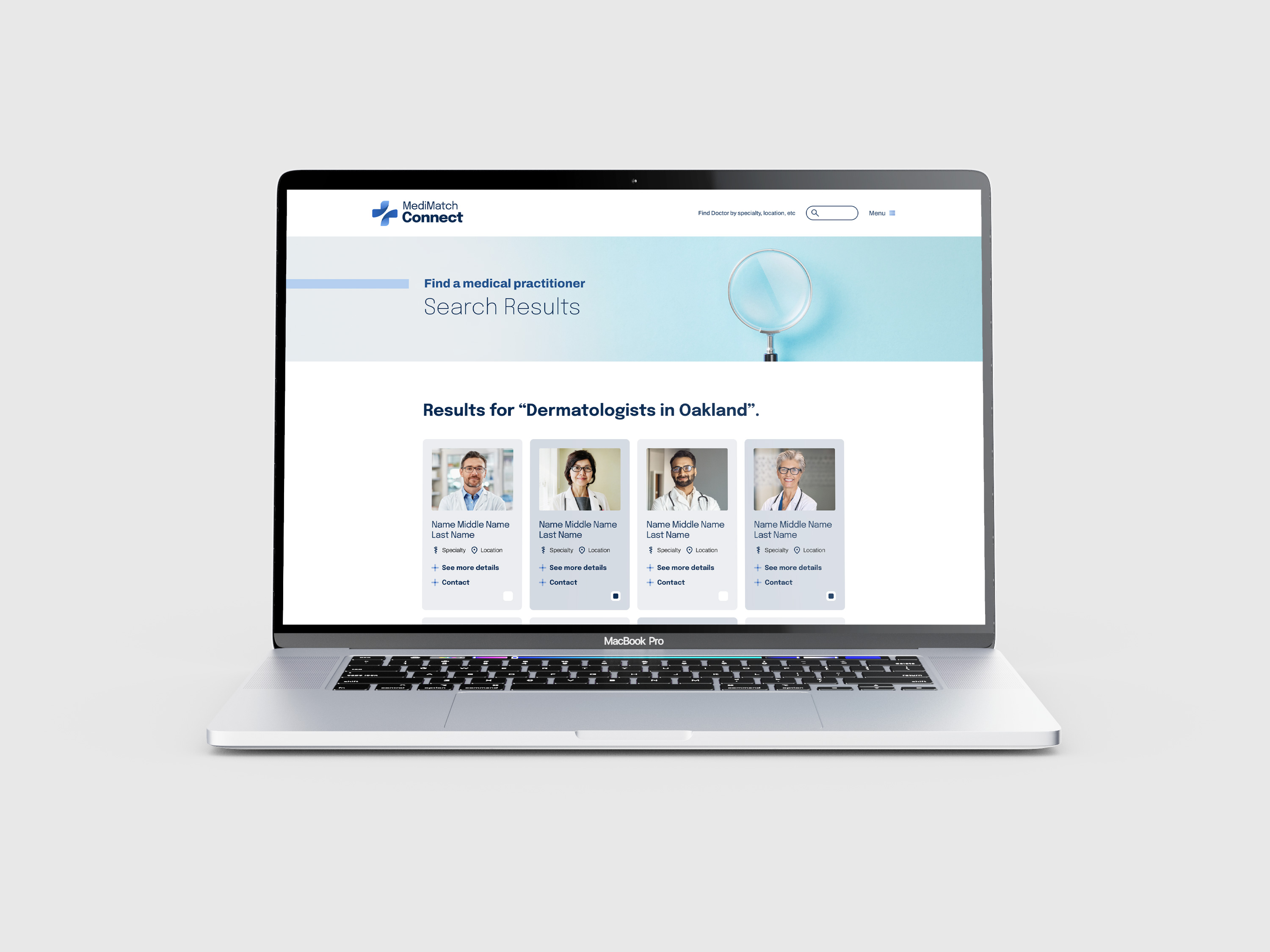
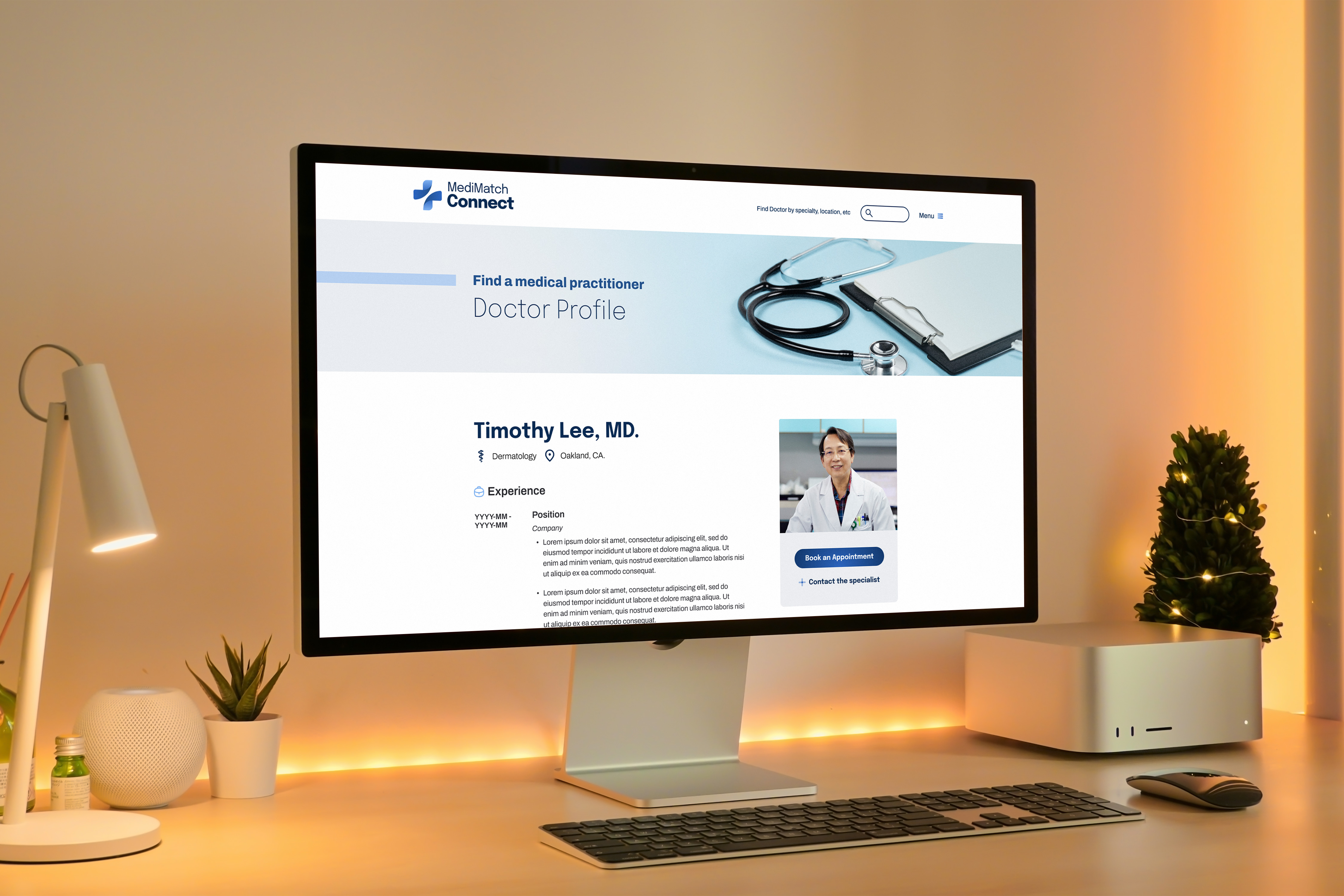
Wireframes
To make the digital wireframes, I started by putting my ideas on paper. Then I began to work on the high-fidelity wireframes in Figma. After several iterations, I came up with these wireframes.
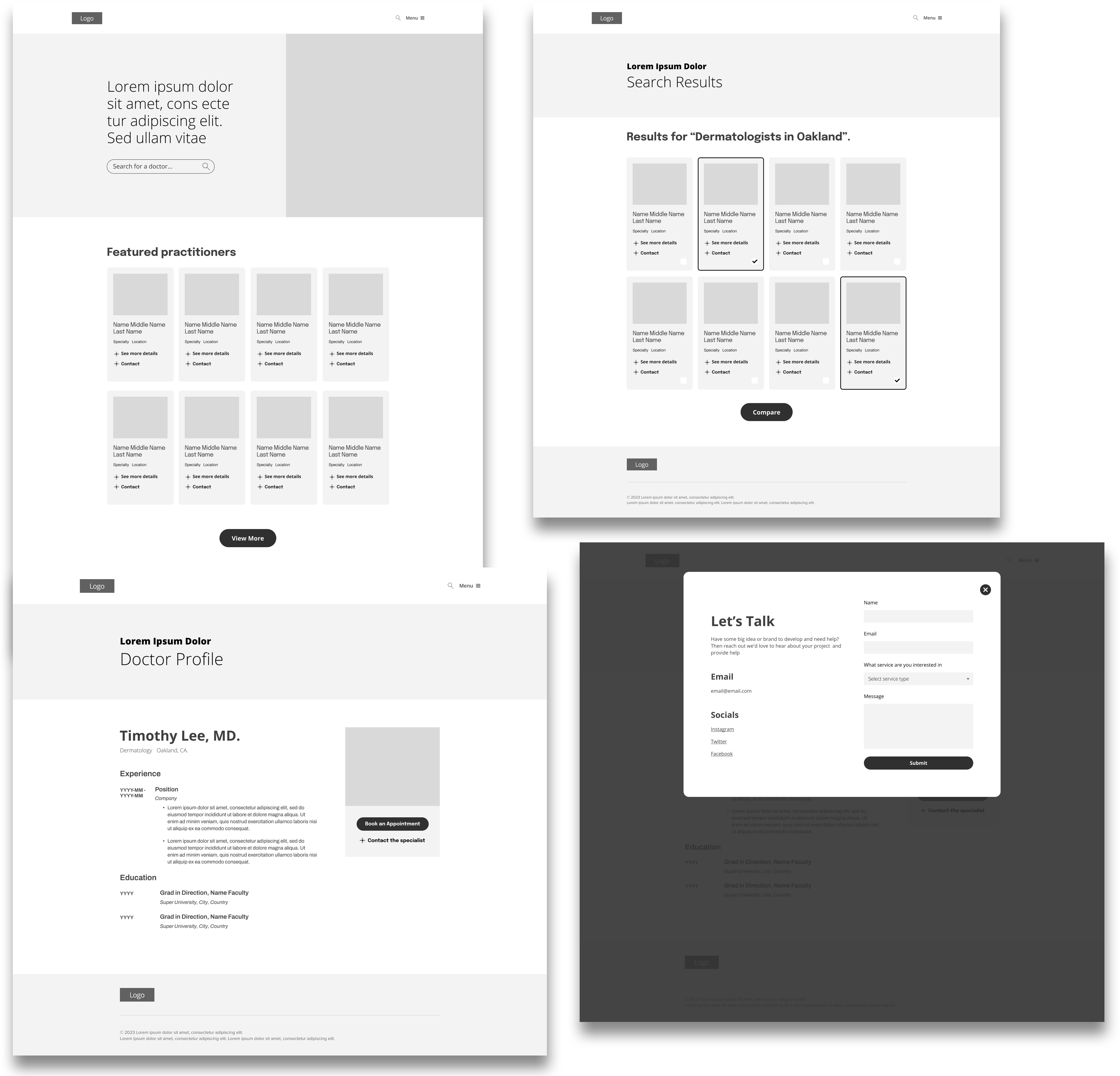
Wireframes - screen size variations
I also started to work on digital wireframes for additional screen sizes to make sure the site would be fully responsive.

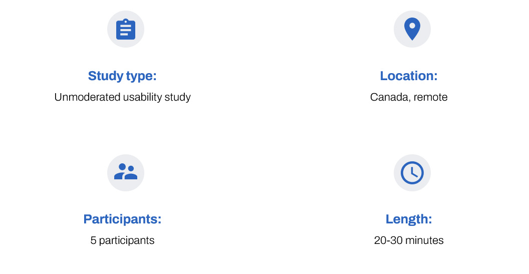
Usability study parameters
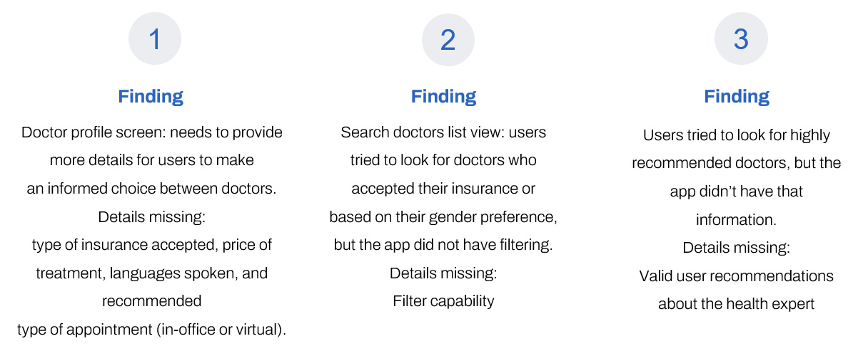
Usability study findings
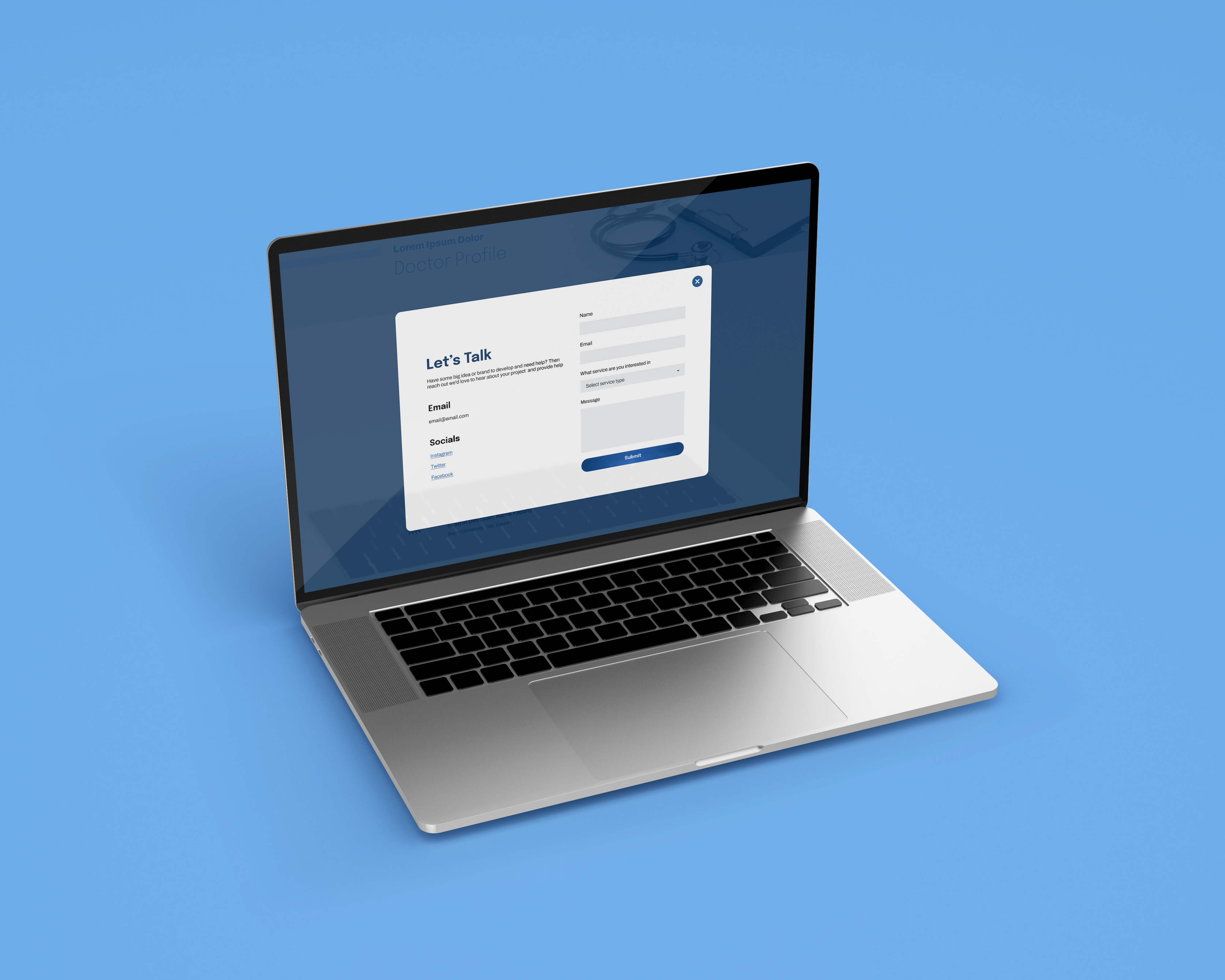
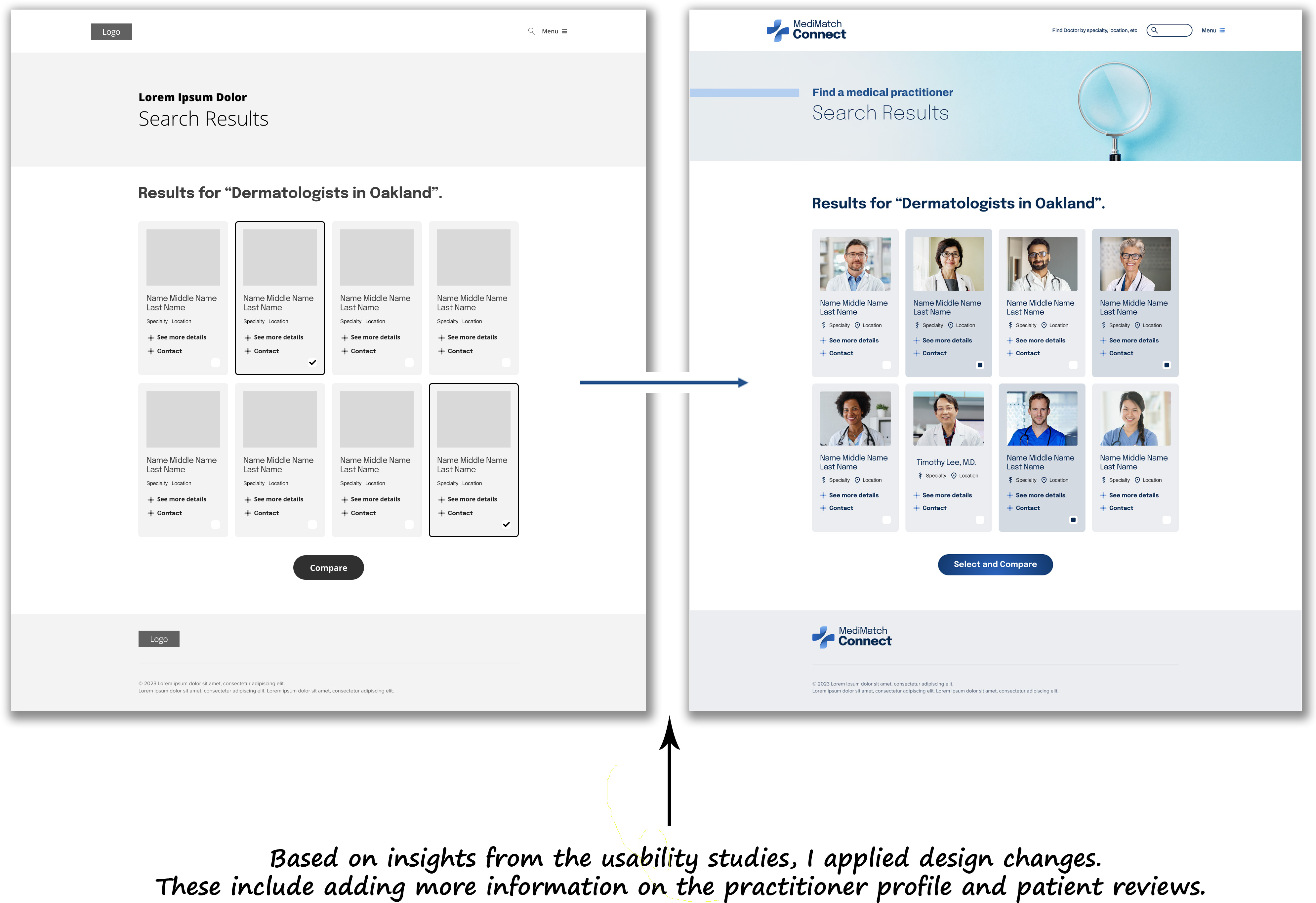
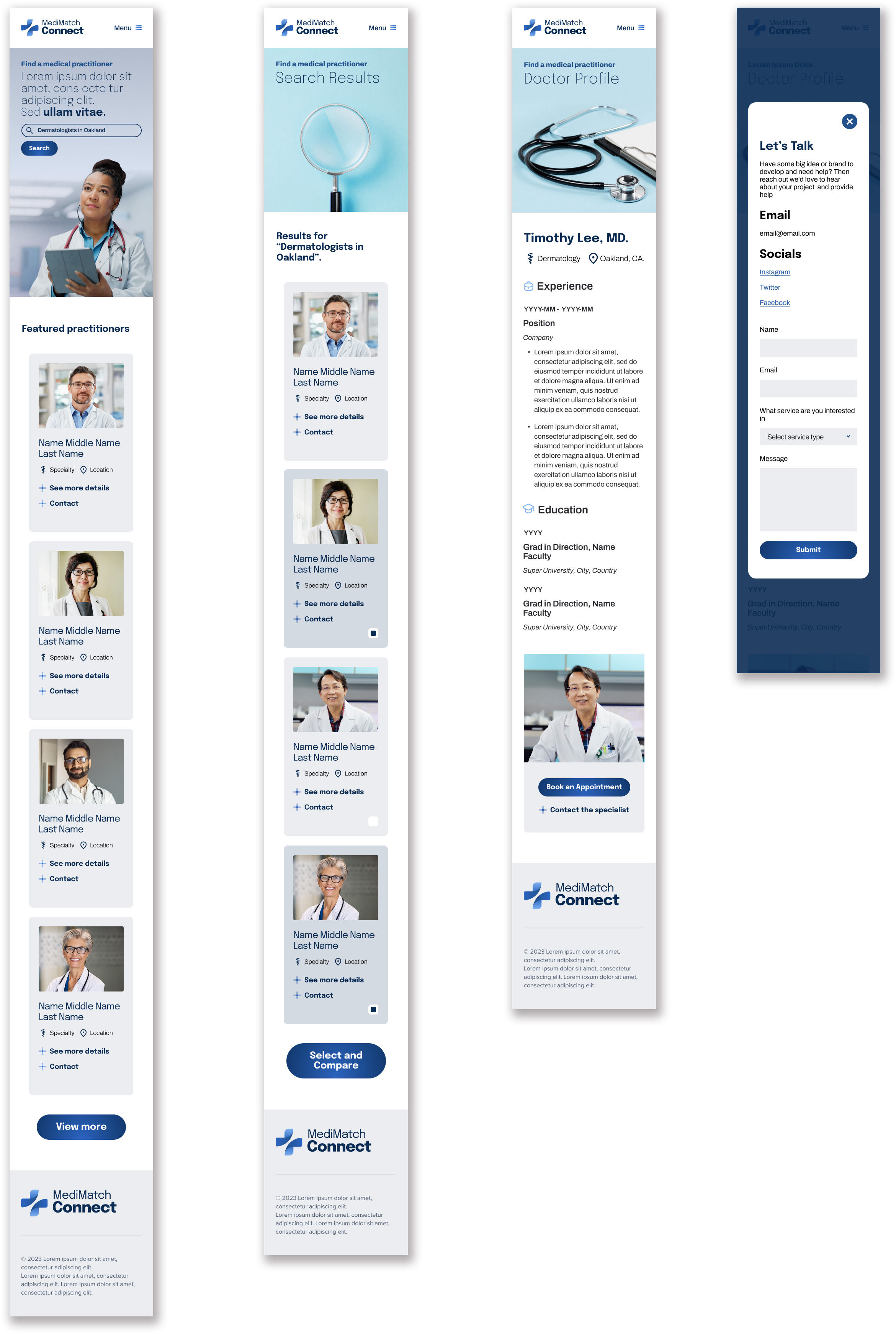
Mockups (After usability study)
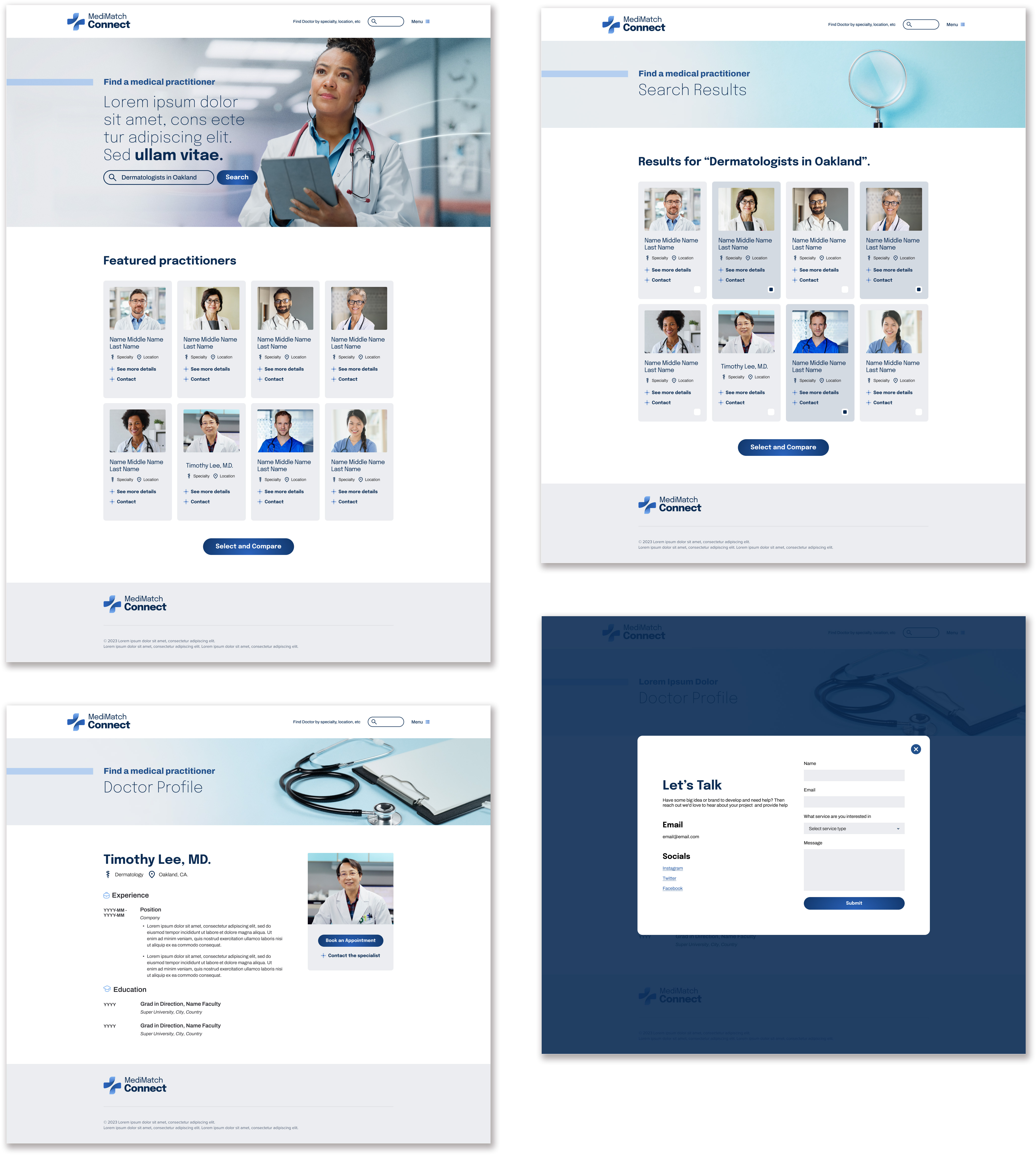
Final designs
Key takeaway
Impact: People are still cautious about using digital medical services as health is a crucial aspect of our lives. In an effort to address this issue, I created a platform that offers various features. The design of this platform presents a challenge because the target audience is broad, ranging from ages 18 to 65. To ensure the best possible user experience, it is important to consider the problems faced by users with existing apps and design an app that has a user-friendly interface.
What I learned: As a UX designer working on a healthcare platform, I have gained valuable insights and knowledge through the design process. Some of the key things I have learned include:
Understanding user needs
Importance of simplicity
Accessibility considerations
User feedback